top of page

Overview
The Mission: After the original portfolio site was lost due to a technical mishap, the goal was to perform a complete "Digital Resurrection"- rebuilding the site from scratch in just 2 weeks while preserving and refining the brand’s minimalist DNA.
The Client: Yair Shvartz, an award-winning writer and director.
Role: Lead UI/UX Designer & Developer (Wix + Velo)
Timeline: 14 Days
Tools: Figma, Wix, Velo (Custom Code)

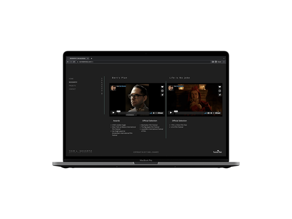
Original Site (Archived)
The Crisis (The Challenge)
The original site was completely offline, leaving the client without a professional presence. The constraints were tight:
-
Zero Assets: No original source code or design files existed.
-
Brand Continuity: The client requested a layout identical to the original, but the original was outdated (2017 style).
-
Speed: A critical industry deadline required the site to be live within 14 days.
The Strategy: Reverse Engineering
Instead of just "copying," I treated this as a Reverse Engineering project. Using archived snapshots (Wayback Machine), I analyzed the original structure and identified opportunities for subtle yet impactful UX improvements:
-
Typography Overhaul: Replacing generic fonts with a refined, cinematic typeface.
-
Grid Alignment: Fixing inconsistent spacing to create a more stable, premium "Magazine" feel.
-
Interactivity: Introducing meaningful motion where it was previously static.

Architecting the Visual Frame

Key Solutions

1. The "Invisible" UI
(Refining Minimalism)
The challenge with extreme minimalism is that it can feel "empty." I refined the vertical text elements and dividers to act as a structural grid, guiding the eye through Yair's filmography without adding visual noise.
2. Custom Interactivity (Flip-Card Logic)
To solve the issue of presenting movie synopses without cluttering the clean visual layout, I implemented a Custom Flip-Card effect via Velo (CSS/JS).
-
UX Goal: Allow users to scan posters quickly and "flip" only for the projects they are interested in.
-
The Tech: Custom code was used to ensure the effect remains smooth and intuitive across all device sizes.


3. Responsive Architecture
The original site was a desktop-only relic that lacked a functional mobile experience.
I redesigned the architecture to be fully responsive, ensuring that the cinematic atmosphere-including the typography and custom Velo interactions-remains intuitive and visually striking on all devices. This involved optimizing image delivery and adapting touch-target areas to provide a seamless mobile experience.
Before vs. After (Visual Evidence)
The Before

The After

Full-Site Interface Showcase
A collection of the finalized high-fidelity screens. Each interface was individually designed to uphold the brand's minimalist 'Invisible UI' philosophy, providing a distraction-free environment for the film content.


Device-Agnostic Precision
I adapted the complex grid and vertical navigation to ensure a flawless experience across Desktop, Tablet, and Mobile.
Each breakpoint was individually refined to maintain the site's dramatic tone while optimizing for touch and readability.


bottom of page